Matija Vojvodic
Flexifind
/25


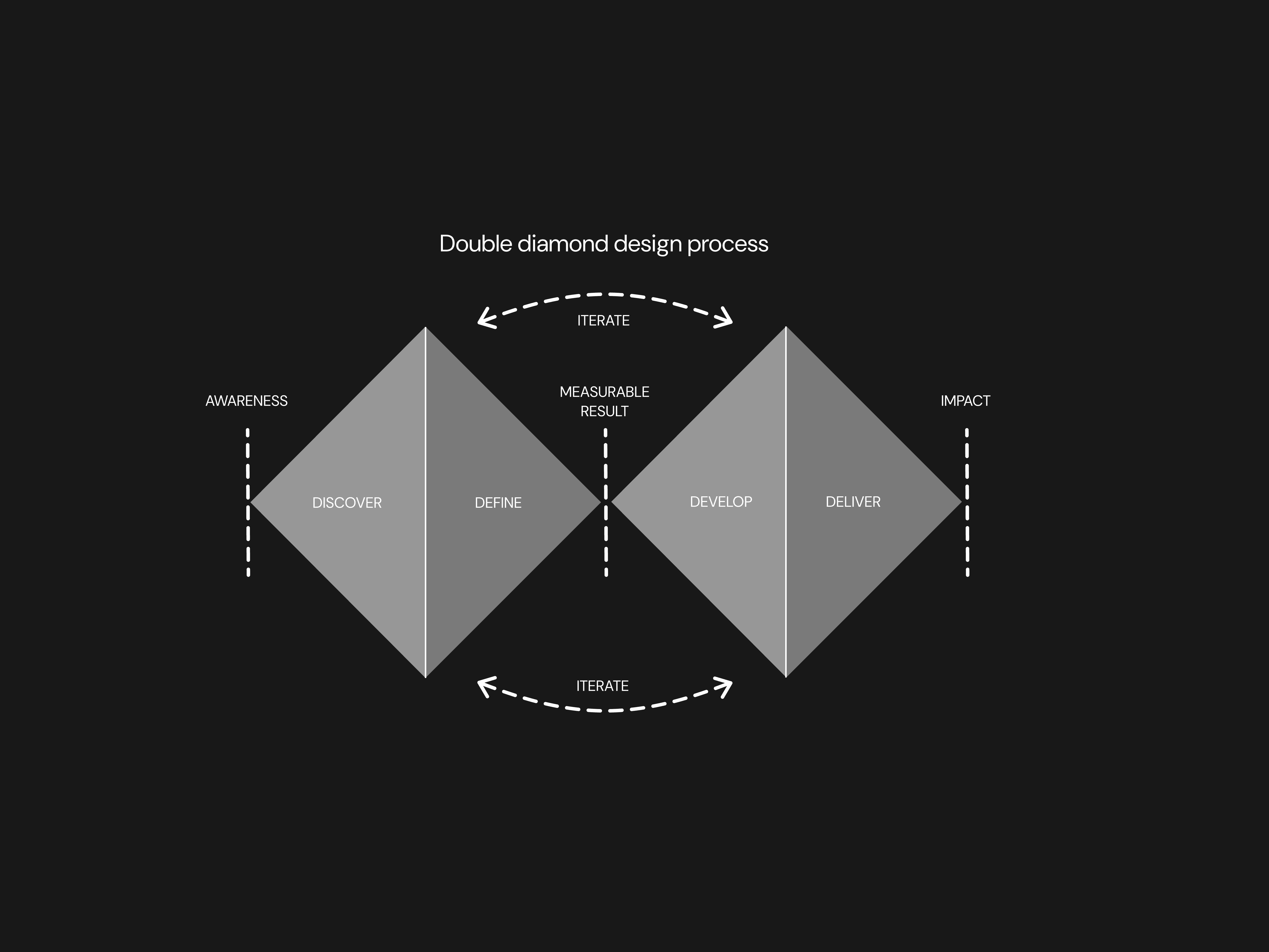
Business Context & KPIs
The business aimed to introduce a commission-only marketplace with automated payment splitting and escrow. I defined the MVP success criteria, focusing on activation, trust, and conversion metrics that the future product team would track after release.
Increase browse-to-signup conversion
Establish trust in milestone payments
Reduce friction in freelancer onboarding
Let freelancers form teams or studios with clear roles and automated payment splitting.
Support clients in evaluating service providers quickly
Problem & Opportunity
Freelancers face high subscription fees and rigid payment structures. Studios struggle with team coordination and splitting revenue. Clients lack trust and clarity when hiring. This created an opportunity to build a platform that reduces financial risk, improves transparency, and accelerates hiring.
Research Insights
Research across freelancers, studio leads, and clients revealed three core needs:
Fair payment control – clients afraid of 100% upfront; freelancers afraid of 100% post-delivery.
Low onboarding friction – users want to browse first, commit later.
Collaborative workflows – teams need ways to work together and split payments.

User Journey & Decisions
I mapped journeys for both clients and service providers to identify friction and motivation moments across the marketplace.
Key Design Decisions
Browse-before-signup to reduce top-of-funnel friction.
Milestone payment builder to replace rigid payment flows.
Unified service cards enabling quick comparative evaluation.
Team-as-studio model enabling revenue splitting and collaboration.
Escrow transparency surfaces reducing psychological trust barriers.

UX Architecture: Designing for Clarity & Collaboration
To organise complex multi-provider workflows, I structured the system using a combination of IA and content modeling with Object-Oriented UX (OOUX).
OOUX helped clarify key objects (Service Provider, Client Organisation, Service, Job Request, Proposal, Team Member, Portfolio Item) and the relationships between them.

Priority Guides
• Simplifying key actions like creating custom payment plans, forming teams, and managing projects.
• Establishing a clear hierarchy of content for complex components (e.g., service cards, team dashboards) to reduce cognitive load.
• Defining the structure of each page to ensure that users – whether clients or service providers – could easily navigate through their respective journeys without feeling overwhelmed.
Wireframes
I created low- and mid-fidelity prototypes to validate the onboarding flow, payment plan creation, and service discovery.
Usability sessions confirmed the core assumptions: users prefer browsing before signup, milestone payments increase perceived fairness, and the team model improves trust in multi-person projects.

High-Fidelity Prototype
The high-fidelity phase focused on validating the full end-to-end experience with real content, final layouts, and interaction patterns. I refined the core flows – service discovery, milestone payments, team collaboration, and project tracking – ensuring they were consistent, intuitive, and aligned with the business goals defined earlier.
The prototype also allowed stakeholders to evaluate cross-screen continuity, behavior in edge cases, and the interaction model for multi-freelancer projects. This became the foundation for the Design System work that followed.

Service Provider Dashboard & Client Project Workspace
FlexiFind includes two distinct workspaces that support the full lifecycle of a B2B service engagement — one designed for Service Providers (companies, studios, and teams of freelancers), and one built for Client Organisations managing active projects.
These spaces are intentionally separated to reflect the different goals, responsibilities, and workflows of each user type.
The Provider Dashboard brings together everything a team needs to deliver client work:
Project Overview — active projects, milestones, deadlines, and delivery status
Analytics — proposal conversion, team utilization, performance insights
Team Management — roles, availability, assignments, expertise
Services — creation, editing, publishing, pricing
Proposals — drafts, negotiations, accepted/declined states
Portfolio — case studies and past work displayed across proposals and services
This dashboard supports operational clarity for teams of any size — from companies to studios to structured freelancer groups.

Design system creation
As part of the high-fidelity design phase, I created a comprehensive design system tailored to FlexiFind’s needs. The system was built to ensure consistency, scalability, and adaptability for both light and dark modes.
The foundation of the design system included color variables, which defined primary, secondary, hover states, and status indicators for both themes. I also developed a typography hierarchy that standardised text styles across headings, body text, and captions. These foundational elements were tokenised to enable seamless updates and integration across components.
I designed reusable components such as buttons, navigation elements, cards, inputs, combo boxes, and search bars. For more complex use cases, I created modules like order status trackers, step-by-step dialogs, and tables. Additionally, I developed page templates for key views, including the home page, vendor dashboards, search results, service pages, and vendor portfolios.

I incorporated light and dark mode variables into every element of the design system. This ensured that users could switch between themes effortlessly while maintaining readability and functionality.
Each component was tracked and tokenized to ensure efficiency during development. I also maintained a detailed changelog with explanations of changes and updates made to the design system. This documentation served as a valuable resource for future designers or design teams, stakeholders, and developers by providing clear insights into the evolution of the system.
The final design system was fully documented in Figma with clear categorisation under foundations (colors, typography), components (buttons, inputs), modules (dialogs, tables), and views (dashboards). This ensured that all stakeholders had access to a well-organized and scalable framework.
