Matija Vojvodic
No-code website builder
/24

Problem
The previous website creation process at Sweap relied on a single static form where users selected checkboxes to include predefined elements on their event websites. While functional, this approach posed several challenges:
Limited Customisation: Users couldn’t adjust layouts or preview changes in real time, resulting in a lack of creative control.
Inefficient Workflow: The rigid structure made it slow to build websites, as users needed to wait for updates after submitting their selections.
Outdated Templates: The templates lacked modern design elements and flexibility, making it difficult to meet diverse user needs.
Lack of Modularity: There were no reusable components or modules that could be easily adapted for different use cases.
These limitations highlighted the need for a more dynamic and user-friendly website-building experience.
Process
1. Information Architecture
The project began with defining the information architecture. Since the old builder imposed certain constraints, I needed to rethink how content would be structured while maintaining compatibility with existing workflows. I created a new architecture that supported modular templates, reusable content (e.g., speakers and partners), and flexible layouts. This ensured that the builder could handle both simple and complex use cases seamlessly.
2. Research & Best Practices
To inform the design, I conducted competitive research on no-code tools like Webflow, Wix, and Squarespace. This helped identify best practices for drag-and-drop interfaces and modular design systems. Additionally, I analyzed patterns specific to event websites to ensure the builder met Sweap’s clients’ needs. The goal was to create a tool that catered to both novice users and experienced designers while maintaining flexibility.
3. Iterative Design Process
Priority Guides
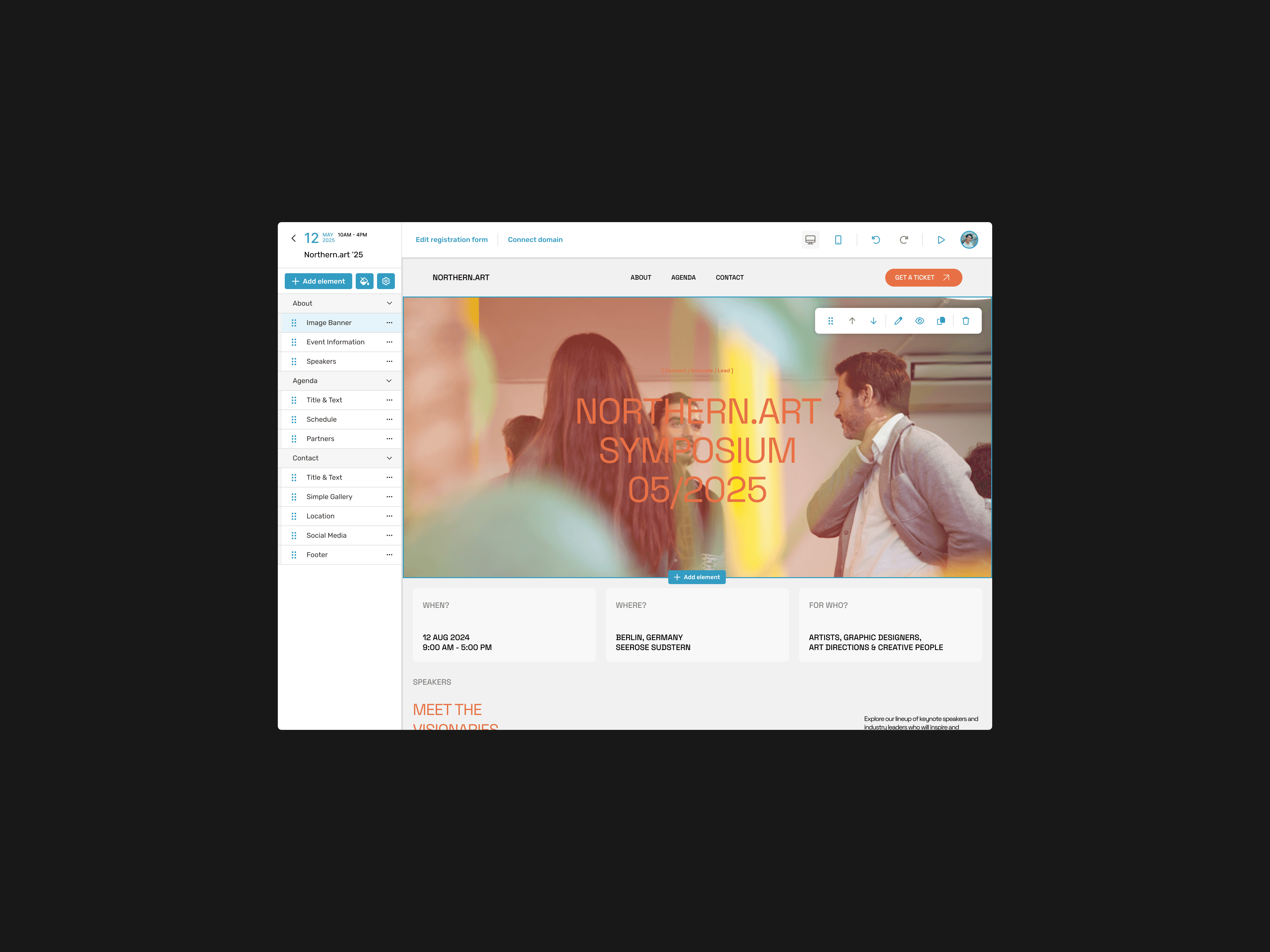
I began by creating priority guides to define the layout and hierarchy of features. The interface was divided into three key areas:
Left Sidebar: Dedicated to content management and styling options.
Top Header: Included essential actions like adding new modules, editing registration forms, undo/redo functionality, and toggling between desktop/mobile views.
Main Canvas: Focused on real-time drag-and-drop interactions for building the website.
These guides ensured that the interface was intuitive and quick to learn while addressing user needs.
Low-Fidelity Wireframes
Using the priority guides as a foundation, I developed low-fidelity wireframes to visualize workflows such as adding modules, customizing layouts, and managing content. Early iterations focused on simplifying interactions:
Dragging modules onto the canvas for immediate placement.
Hover-over functionality for editing directly in the preview area.
Options for hiding modules instead of deleting them entirely.
Feedback from internal testing highlighted areas for improvement, such as clearer visual cues for module placement and alignment.
Mid-Fidelity Prototypes
Building on the wireframes, I created mid-fidelity prototypes that introduced interactivity:
Added hover states and button interactions for key actions.
Incorporated undo/redo functionality in the top header.
Designed a toggle for desktop/mobile views to allow users to preview their websites across devices seamlessly.
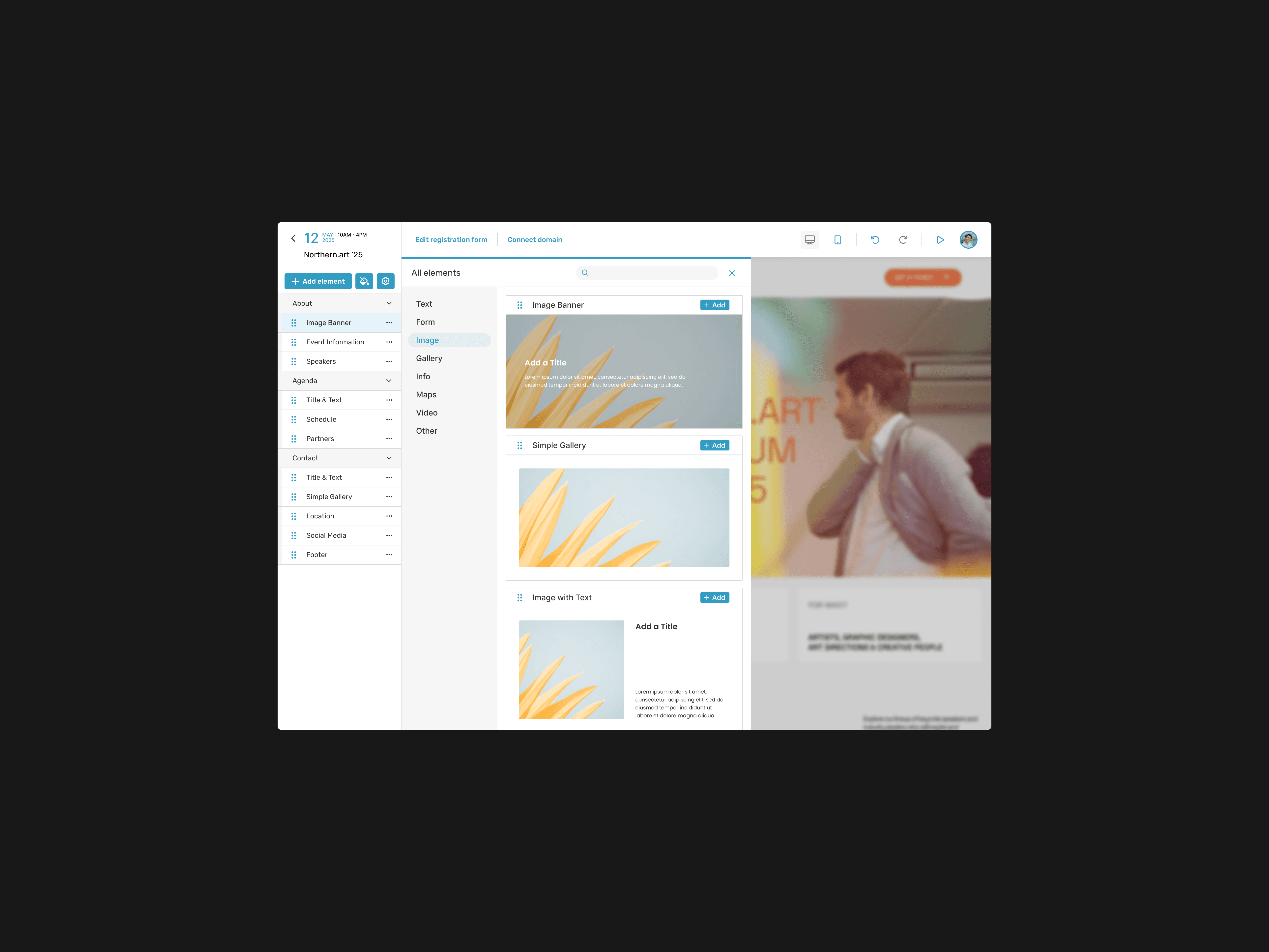
These prototypes were tested with internal teams and select clients. Feedback revealed that users struggled to identify what each module did before adding it to their website. In response, I added preview images for all modules in the sidebar and included demo content within modules upon placement (e.g., placeholder text/images).
4. Global Styling Framework
To provide flexibility while maintaining consistency, I developed a global styling framework:
Defined global fonts (H1–H5), paragraph styles, paddings, margins, border radii, and color palettes.
Enabled modules to inherit global styles but allowed advanced users to customize them further with HTML/CSS. This ensured that users with no design experience could create professional-looking websites while giving designers full creative freedom.
Low-Fidelity Wireframes
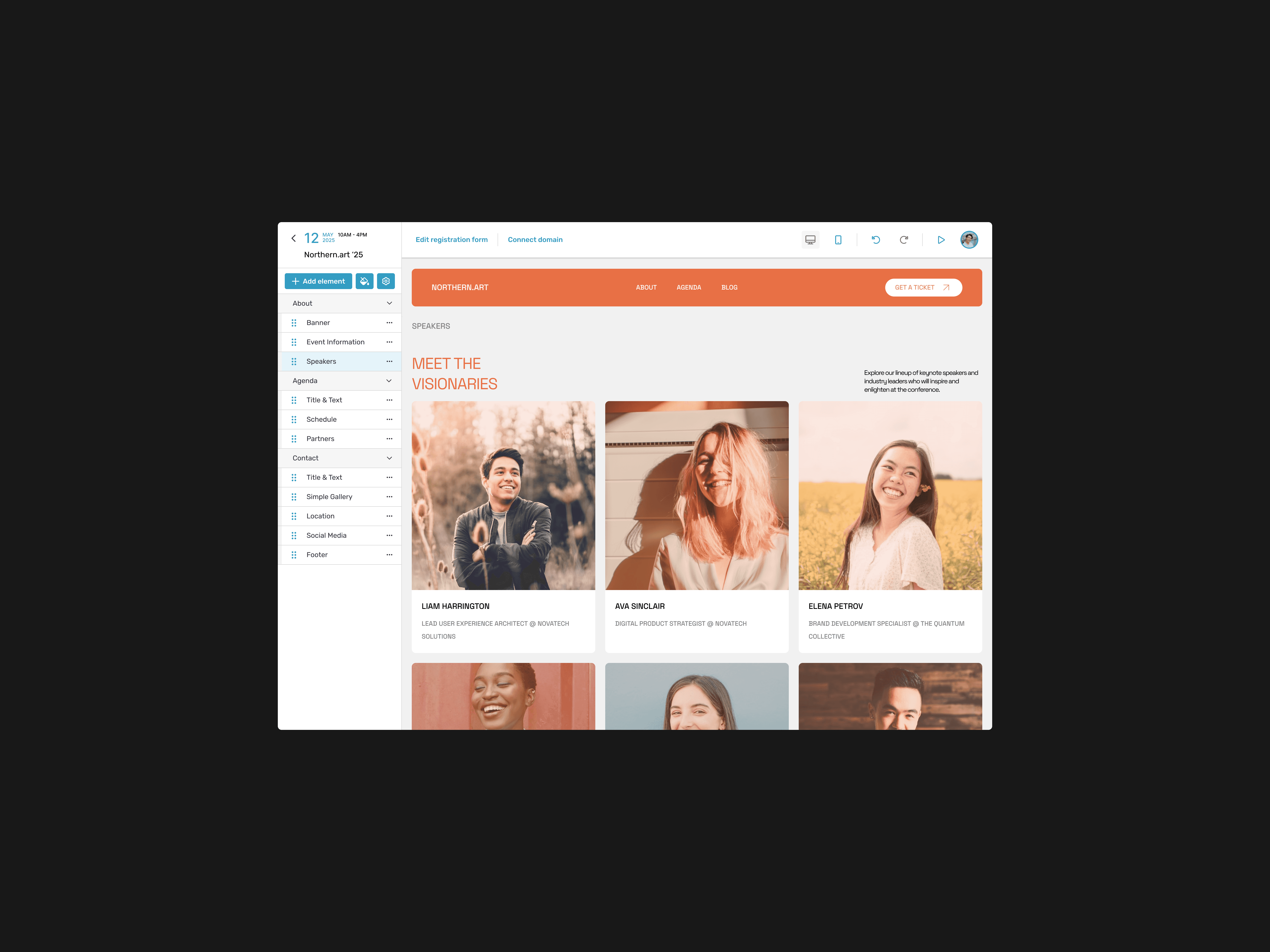
For B2B2C users who frequently reused speakers or partner logos across multiple events:
• I implemented a system where speaker profiles and partner information were stored at the account level.
• Users could pull this content into any website without needing to re-upload images or recreate entries.
This feature significantly streamlined workflows for Sweap’s enterprise clients.
Mid-Fidelity Prototypes
Once the wireframes were validated, I developed mid-fidelity prototypes to incorporate additional functionality and interactions:
Introduced interactive elements such as hover states, clickable buttons, and dynamic flows for features like payment plan customization and team collaboration tools.
Conducted usability testing sessions with freelancers, studios, and stakeholders to evaluate the prototypes’ effectiveness in addressing user needs.
Feedback from these sessions guided further refinements, ensuring that the prototypes accurately represented real-world use cases while maintaining an intuitive interface.
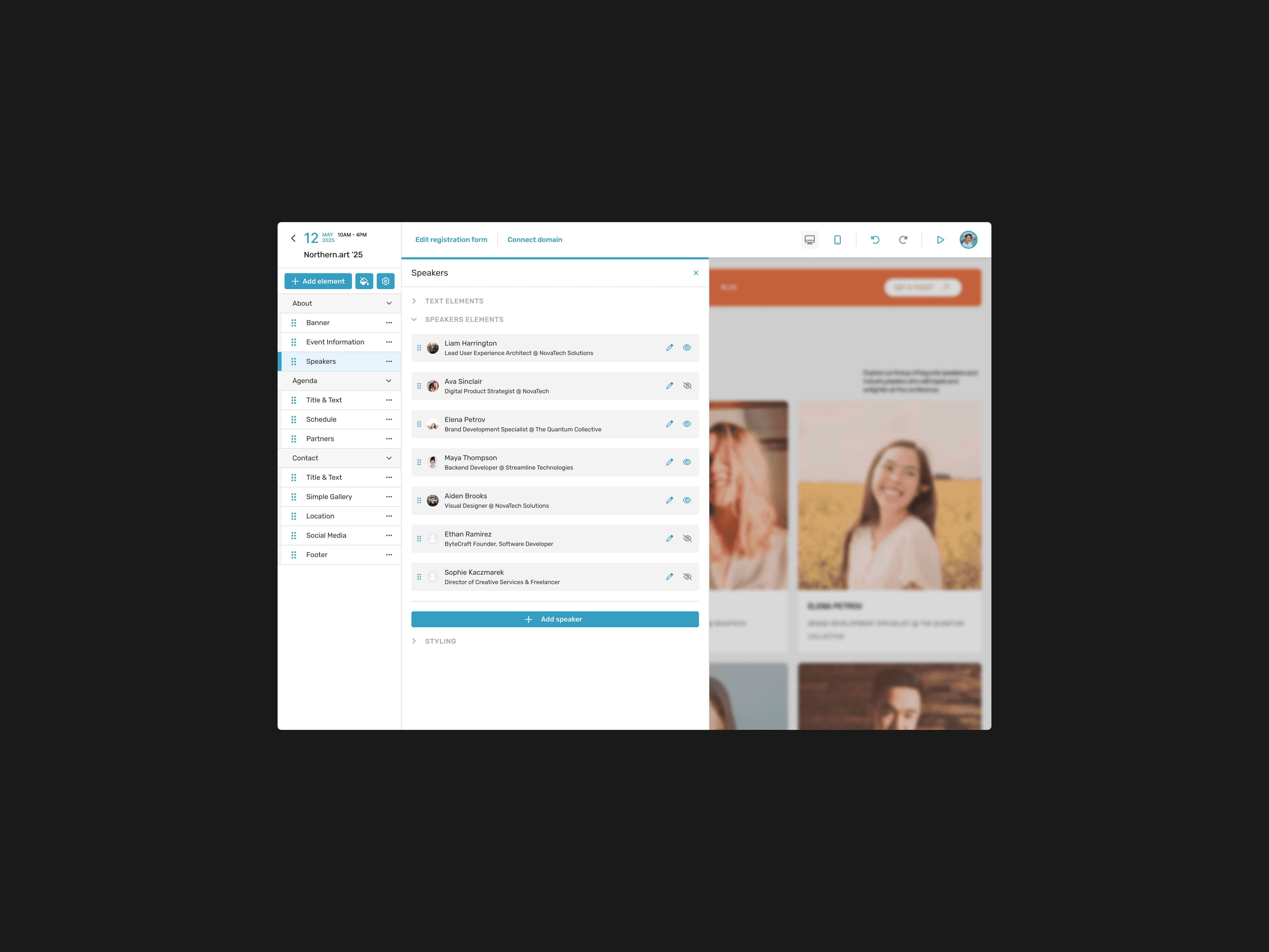
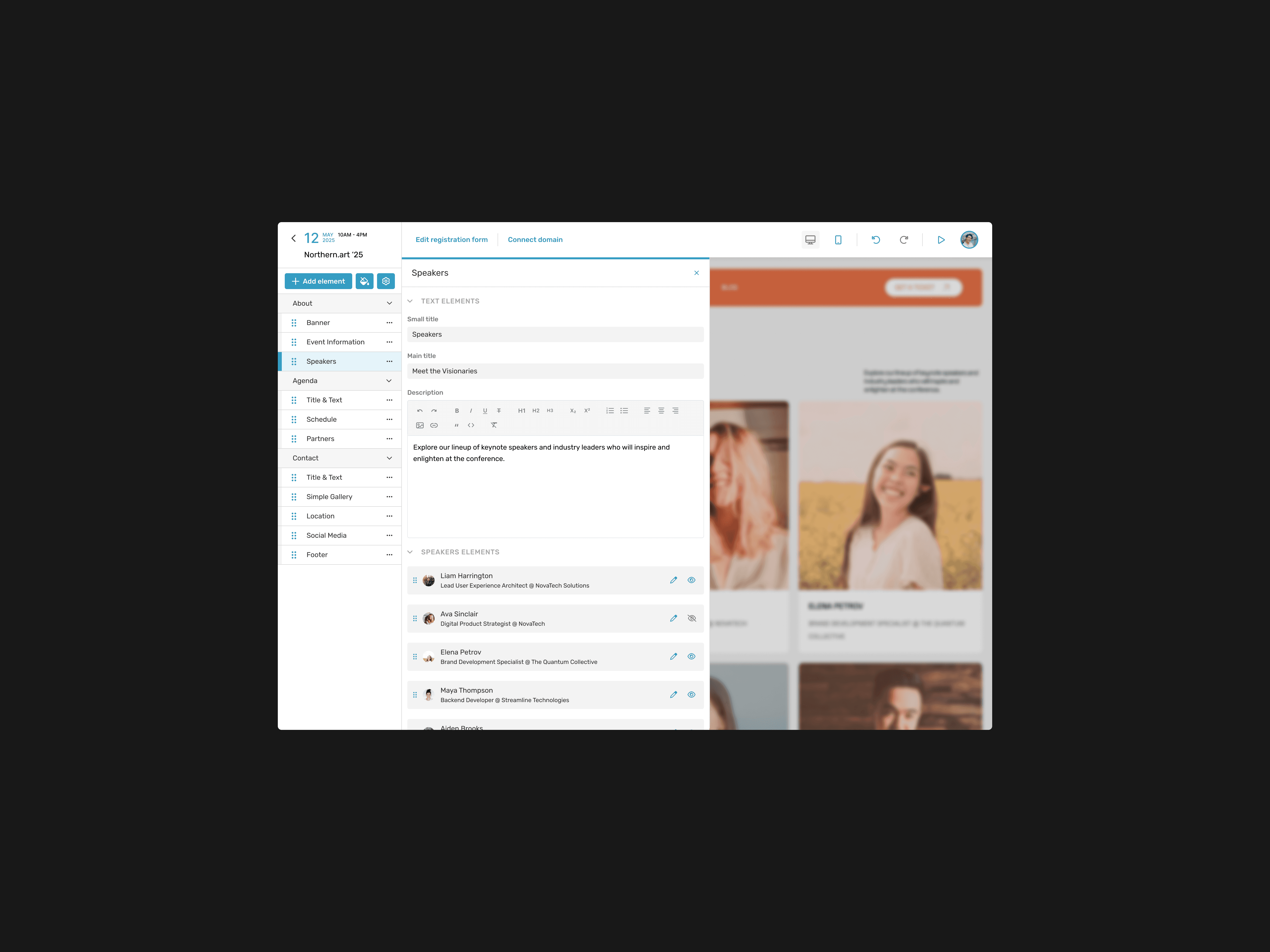
5. Modular Design & Real-Time Editing
The builder’s core feature was its modular design system:
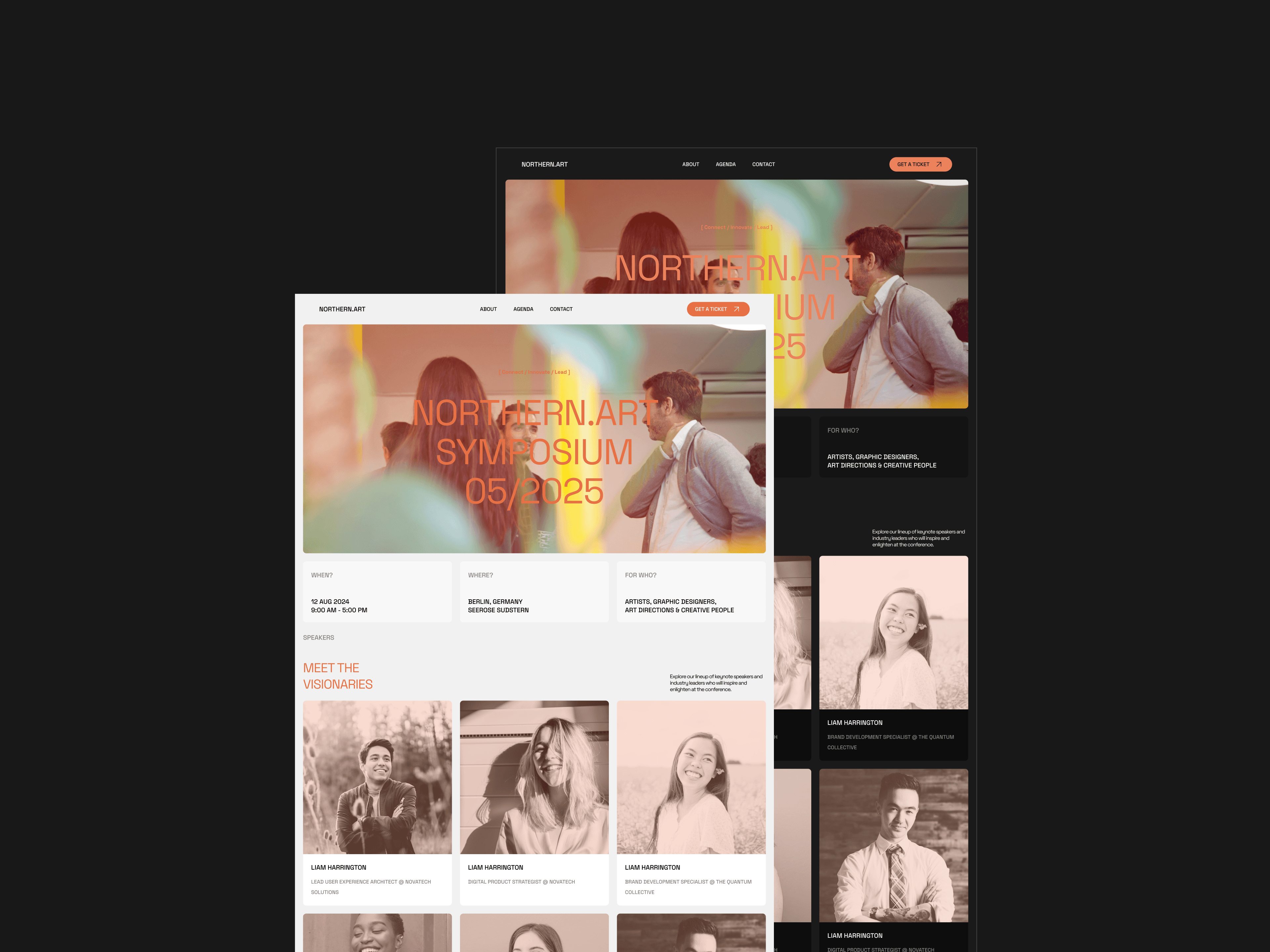
Users could drag and drop modules (e.g., registration forms, speaker profiles) onto sections of their website.
Modules were editable directly within the preview mode using hover-over functionality.
Sections could be reordered or hidden without deletion.
Real-time updates allowed users to see changes instantly without needing to refresh or reload pages.
5. Modular Design & Real-Time Editing
As part of the high-fidelity design phase, I created a comprehensive design system tailored to FlexiFind’s needs. The system was built to ensure consistency, scalability, and adaptability for both light and dark modes.
The foundation of the design system included color variables, which defined primary, secondary, hover states, and status indicators for both themes. I also developed a typography hierarchy that standardised text styles across headings, body text, and captions. These foundational elements were tokenised to enable seamless updates and integration across components.
I designed reusable components such as buttons, navigation elements, cards, inputs, combo boxes, and search bars. For more complex use cases, I created modules like order status trackers, step-by-step dialogs, and tables. Additionally, I developed page templates for key views, including the home page, vendor dashboards, search results, service pages, and vendor portfolios.
6. Testing & Refinement
The builder underwent three rounds of testing:
1. Internal Testing: Focused on usability issues like module placement and alignment cues.
2. Client Testing: Gathered feedback from Sweap’s clients about clarity and functionality. Based on this feedback:
• Added preview images for modules in the sidebar.
• Introduced demo content within modules upon placement to reduce learning curves.
• Adjusted button structures in the header for better clarity.
3. Final Refinements: Ensured all features were polished and intuitive before launch.
Impact
The upgraded Sweap Website Builder delivered significant improvements: in usability, flexible design options, & streamlined workflows. This project successfully modernised Sweap’s website creation process while setting a new standard for usability in event management tools.